Lady Gaga
A concert brand package for Lady Gaga, inspired by the song Telephone.
Software: Illustrator, Indesign, Photoshop
Year: 2022
Project Category: Branding, Design
Deliverables:
-
Poster
-
Animated poster
-
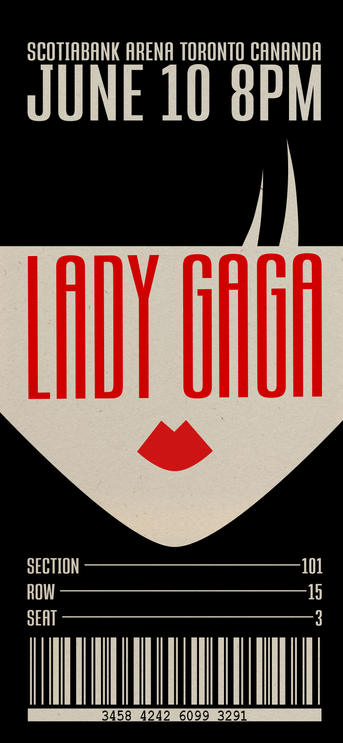
Mobile ticket
-
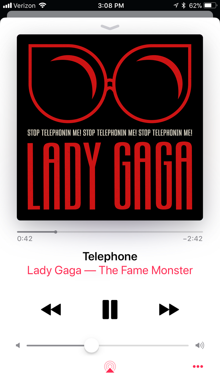
Album over
-
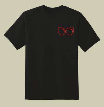
Merch
Anger and Attitude:
What if the frusteration of being overworked and overwhelmed could be translated into a design style that captured the essence of Lady Gaga’ signature style and resentment towards her managers?
Tone: Loud, bold, upbeat
Show Info:
Design:
Venue: Scotiabank Arena
Date: 06/10/2009
Time: 8pm EST
Opening artist: Rina Sawayama
Lady Gaga’s style is notoriously decadent and expressive, so this style would be appropriate to show how her managers don’t allow her creative process to take its natural shape. This design also relies heavily on a grid. The emphasis on structure is symbolic for the way Gaga feels trapped by the pressure of having worldwide fame.
The color palette borrows from Constructivism, which was the original vision for this direction. Although the design took on a different look, the Constructivism color palete is still appropriate. It is bold, eye-catching, and timeless. The design elements found in this aesthetic are straight lines, right angles, bold and elongated type, positive negative, and high contrast.
Song Choice:
Telephone is about working too hard and wanting a day off. “The Fame Monster” album, as a whole, is about the dark side of achieving worldwide fame. On the surface, she is simply annoyed that her significant other is being clingy and won’t leave her alone. The deeper meaning to the song is about . Or, it could also be her own self doubt constantly questioning if she has worked for her success


